CSSマスク
目次
CSSマスクとは
- 透過情報を含む PNG や SVG 画像を用いてコンテンツをマスキングする機能です。
- IE を除く大半のブラウザでサポート済です。(Can I use...)
- CORS 制限によりローカルファイルでは機能しません。
http://またはhttps://でアクセスする環境で試してください。
CSSマスクプロパティ
下記の4枚の画像を用います。1枚は通常画像、ひし形(rhombus)と三角(triangle)はアルファ値を用いた透過画像、最後の1枚はグラデーション画像です。


マスクイメージ(mask-image)
mask-image は画像、テキスト、背景画像などのコンテンツに対してマスク画像で指定したマスクをかけます。
CSS
#img-image {
  mask-image: url(mask-rhombus.png);
}
HTML
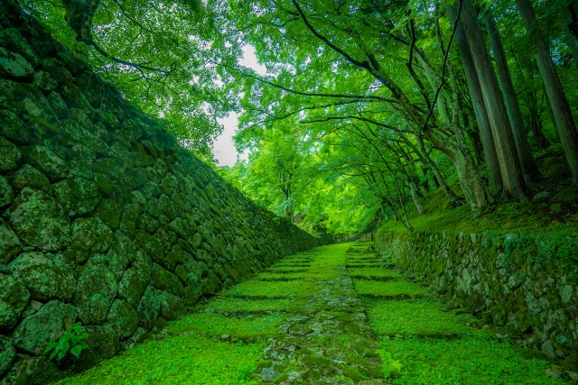
<img id="img-image" src="green-moss.jpg" alt="Green-moss" width=120 height=80>
表示
マスクサイズ(mask-size)
mask-size はマスク画像のサイズ(横幅, 高さ)を指定します。
CSS
#img-size {
  mask-image: url(mask-rhombus.png);
  mask-size: 30px 20px;
}
HTML
<img id="img-size" src="green-moss.jpg" alt="Green-moss" width=120 height=80>
表示
マスクの繰り返し(mask-repeat)
mask-repeat はマスク画像の繰り返しを制御します。
- repeat : 繰り返す。デフォルト値。
- repeat-x : X軸方向のみ繰り返す。
- repeat-y : Y軸方向のみ繰り返す。
- no-repeat : 繰り返さない。
- space : 整数個繰り返す。余白にスペースを入れる。
- round : 整数個繰り返す。余白が生じないようにマスクを拡大・縮小する。
CSS
#img-repeat {
  mask-image: url(mask-rhombus.png);
  mask-size: 30px 20px;
  mask-repeat: repeat-x;
}
HTML
<img id="img-repeat" src="green-moss.jpg" alt="Green-moss" width=120 height=80>
表示
マスクモード(mask-mode)
mask-mode はマスクの透過モードを指定します。
- alpha : マスク画像のアルファ値で透過します。
- luminance : マスク画像の輝度で透過します。
- match-source : マスク画像が
<mask-source>型であればマスク画像のmask-type値(デフォルトはluminance) に従います。マスク画像が<image>型であればマスク画像のアルファ値でマスクします。デフォルト値。
CSS
#img-mode {
  mask-image: url(mask-gradation.png);
  mask-mode: luminance;
}
HTML
<img id="img-mode" src="green-moss.jpg" alt="Green-moss" width=120 height=80>
表示
マスクポジション(mask-position)
mask-repeat はマスク表示の相対位置を指定します。
CSS
#img-position {
  mask-image: url(mask-rhombus.png);
  mask-size: 30px 20px;
  mask-repeat: no-repeat;
  mask-position: 50% 50%;
}
HTML
<img id="img-position" src="green-moss.jpg" alt="Green-moss" width=120 height=80>
表示
マスク開始位置(mask-origin)
mask-origin はマスク画像の相対位置の原点を指定します。
- content-box : コンテンツボックスからの相対位置に表示します。
- padding-box : パディングボックスからの相対位置に表示します。
- border-box : ボーダーボックスからの相対位置に表示します。デフォルト値。
- その他 :
mask-originを参照してください。
CSS
.my-image-box {
  display: inline-block;
  background-color: #99f;
}
.my-image-box img {
  padding: 10px;
  margin: 10px;
  border: 10px solid #9f9;
  background-color: #f99;
}
#img-origin-content {
  mask-image: url(mask-rhombus.png);
  mask-repeat: no-repeat;
  mask-origin: content-box;
}
#img-origin-padding {
  mask-image: url(mask-rhombus.png);
  mask-repeat: no-repeat;
  mask-origin: padding-box;
}
#img-origin-border {
  mask-image: url(mask-rhombus.png);
  mask-repeat: no-repeat;
  mask-origin: border-box;
}
HTML
<div class="my-image-box">
  <img id="img-origin" src="green-moss.jpg" alt="Green-moss" width=120 height=80>
</div>
<div class="my-image-box">
  <img id="img-origin-content" src="green-moss.jpg" alt="Green-moss" width=120 height=80>
</div>
<div class="my-image-box">
  <img id="img-origin-padding" src="green-moss.jpg" alt="Green-moss" width=120 height=80>
</div>
<div class="my-image-box">
  <img id="img-origin-border" src="green-moss.jpg" alt="Green-moss" width=120 height=80>
</div>
表示
マスククリップ範囲(mask-clip)
mask-clip はマスク指定時の描画範囲を指定します。
- content-box : コンテンツボックス範囲に限ります。。
- padding-box : パディングボックス範囲に限ります。。
- border-box : ボーダーボックス範囲に限ります。。デフォルト値。
- その他 :
mask-originを参照してください。
下記の例ではマスク画像の開始位置はすべて border-box にしておき、mask-clip の値のみを変更しています。
表示
マスク混合モード(mask-composite)
mask-clip は複数のマスクを指定した場合の混合モードを指定します。
- add : 下位のマスクに上位のマスクを加えます。デフォルト値。
- subtract : 下位のマスクから上位のマスクを除外します。
- intersect : 下位のマスクと上位のマスクの重複部がマスクとなります。
- exclude : 下位のマスクと上位のマスクの重複していない部分がマスクとなります。
下記の2枚のマスクを用います。
CSS
#img-composite-add {
  mask-image: url(mask-rhombus.png), url(mask-triangle.png);
  mask-composite: add;
}
#img-composite-subtract {
  mask-image: url(mask-rhombus.png), url(mask-triangle.png);
  mask-composite: subtract;
}
#img-composite-intersect {
  mask-image: url(mask-rhombus.png), url(mask-triangle.png);
  mask-composite: intersect;
}
#img-composite-exclude {
  mask-image: url(mask-rhombus.png), url(mask-triangle.png);
  mask-composite: exclude;
}
CSS
<img id="img-composite-add" src="green-moss.jpg" alt="Green-moss" width=120 height=80>
<img id="img-composite-subtract" src="green-moss.jpg" alt="Green-moss" width=120 height=80>
<img id="img-composite-intersect" src="green-moss.jpg" alt="Green-moss" width=120 height=80>
<img id="img-composite-exclude" src="green-moss.jpg" alt="Green-moss" width=120 height=80>
表示
マスク(mask)
mask は上記の mask-* をまとめて指定します。
CSS
#img {
  /* mask-image: url(mask-rhombus.png); */
  /* mask-position: 10px 10px; */
  /* mask-size: 120px 80px; */
  /* mask-repeat: no-repeat; */
  /* mask-origin: border-box; */
  /* mask-clip: content-box; */
  /* mask-composite: add; */
  /* mask-mode: alpha; */
  mask: url(mask-rhombus.png) 10px 10px / 120px 80px no-repeat border-box content-box add alpha;
}
リンク
Copyright (C) 2024 杜甫々
初版:2024年12月29日 最終更新:2024年12月29日
https://www.tohoho-web.com/ex/css-mask.html